Entrepreneurial Geekiness

Future Cities Hackathon (@ds_ldn) Oct 2013 on Parking Usage Inefficiencies
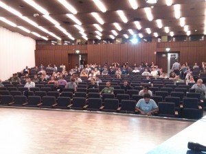
On Saturday six of us attended the Future Cities Hackathon organised by Carlos and DataScienceLondon (@ds_ldn). I counted about 100 people in the audience (see lots of photos, original meetup thread), from asking around there seemed to be a very diverse skill set (Python and R as expected, lots of Java/C, Excel and other tools). There were several newly-released data sets to choose from. We spoke with Len Anderson of SocITM who works with Local Government, he suggested that the parking datasets for Westminster Ward might be interesting as results with an economic outcome might actually do something useful for Government Policy. This seemed like a sensible reason to tackle the data. Other data sets included flow-of-people and ASBO/dog-mess/graffiti recordings.
Overall we won ‘honourable mention’ for proposing the idea that the data supported a method of changing parking behaviour whilst introducing the idea of a dynamic pricing model so that parking spaces might be better utilised and used to generate increased revenue for the council. I suspect that there are more opportunities for improving the efficiency of static systems as the government opens more data here in the UK.
Sidenote – previously I’ve thought about the replacement of delivery drivers with self-driving cars and other outcomes of self-driving vehicles, the efficiencies discussed here connect with those ideas.
With the parking datasets we have over 4 million lines of cashless parking-meter payments for 2012-13 in Westminster to analyse, tagged with duration (you buy a ticket at a certain time for fixed periods of time like 30 minutes, 2 hours etc) and a latitude/longitude for location. We also had a smaller dataset with parking offence tickets (with date/time and location – but only street name, not latitude/longitude) and a third set with readings from the small number of parking sensors in Westminster.
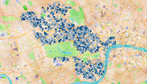
Ultimately we produced a geographic plot of over 1000 parking bays, coloured by average percentage occupancy in Westminster. The motivation was to show that some bays are well used (i.e. often have a car parked in them) whilst other areas are under-utilised and could take a higher load (darker means better utilised):
At first we thought we’d identified a striking result. After a few more minutes hacking (around 9.30pm on the Saturday) we pulled out the variance in pricing per bay and noted that this was actually quite varied and confusing, so a visitor to the area would have a hard time figuring out which bays were likely to be both under-utilised and cheap (darker means more expensive):
If we’d have had more time we’d have checked to see which bays were likely to be under-utilised and cheap and ranked the best bays in various areas. One can imagine turning this into a smartphone app to help visitors and locals find available parking.
The video below shows the cost and availability of parking over the course of the day. Opacity (how see-through it is) represents the expense – darker means more expensive (so you want to find very-see-through areas). Size represents the number of free spaces, bigger means more free space, smaller (i.e. during the working day) shows that there are few free spaces:
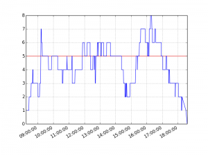
Behind this model we captured the minute-by-minute stream of ticket purchases by lat/lng to model the occupancy of bays, the data also records the number of bays that can be maximally used (but the payment machines don’t know how many are in use – we had to model this). Using Pandas we modelled usage over time (+1 for each ticket purchase and -1 for each expiry), the red line shows the maximum number of bays that are available, the sections over the line suggest that people aren’t parking for their full allocation (e.g. you might buy an hour’s ticket but only stay for 20 minutes, then someone else buys a ticket and uses the same bay):
We extended the above model for one Tuesday over all the 1000+ plus parking bays in Westminster.
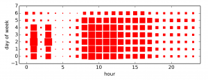
Additionally this analysis by shows the times and days when parking tickets are most likely to be issued. The 1am and 3am results were odd, Sunday (day 6) is clearly the quietest, weekdays at 9am are obviously the worst:
Conclusion:
We believe that the carrot and stick approach to parking management (showing where to park – and noting that you’ll likely get fined if you don’t do it properly) should increase the correct utilisation of parking bays in Westminster which would help to reduce congestion and decrease driver-frustration, whilst increasing income for the local council.
Update – at least one parking area in New Zealand are experimenting with truly dynamic demand-based pricing.
We also believe the data could be used by Traffic Wardens to better patrol the high-risk areas to deter poor parking (e.g. double-parking) which can be a traffic hazard (e.g. by obstructing a road for larger vehicles like Fire Engines). The static dataset we used could certainly be processed for use in a smartphone app for easy use, and updated as new data sets are released.
Our code is available in this github repo: ParkingWestminster.
Here’s our presentation:
Team:
- Amit Nandi
- Bart Baddeley
- Dominic Steinitz (Dominic’s write-up)
- Jackie Steinitz
- Ian Ozsvald (me!)
- Mateusz Łapsa-Malawski
Tools used:
- Python and IPython
- Pandas
- QGIS (visualisation of shapefiles backed by OpenLayers maps from Google and OSM)
- pyshp to handle shapefiles
- Excel (quick analysis of dates and times, quick visualisation of lat/lng co-ords)
- HackPad (useful for lightweight note/URL sharing and code snippet collaboration)
Some reflections for future hackathons:
- Pre-cleaning of data would speed team productivity (we all hacked various approaches to fixing the odd Date and separate Time fields in the CSV data and I suspect many in the room all solved this same problem over the first hour or two…we should have flagged this issue early on and a couple of us solved it and written out a new 1.4GB fixed CSV file for all to share)
- Decide early on on a goal – for us it was “work to show that a dynamic pricing model is feasible” – that lets you frame and answer early questions (quite possibly an hour in we’d have discovered that the data didn’t support our hypothesis – thankfully it did!)
- Always visualise quickly – whilst I wrote a new shapefile to represent the lat/lng data Bart just loaded it into Excel and did a scatter plot – super quick and easy (and shortly after I added the Map layer via QGIS so we could line up street names and validate we had sane data)
- Check for outliers and odd data – we discovered lots of NaN lines (easily caught and either deleted or fixed using Pandas), these if output and visualised were interpreted by QGIS as an extreme but legal value and so early on we had some odd visuals, until we eyeballed the generated CSV files. Always watch for NaNs!
- It makes sense to print a list of extreme and normal values for a column, again as a sanity check – histograms are useful, also sets of unique values if you have categories
- Question whether the result we see actually would match reality – having spent hours on a problem it is nice to think you’ve visualised something new and novel but probably the data you’re drawing is already integrated (e.g. in our case at least some drivers in Westminster would know where the cheap/under-utilised parking spaces would be – so there shouldn’t be too many)
- Setup a github repo early and make sure all the team can contribute (some of our team weren’t experienced with github so we deferred this step and ended up emailing code…that was a poor use of time!)
- Go visit the other teams – we hacked so intently we forgot to talk to anyone else…I’m sure we’d have learned and skill-shared had we actually stepped away from our keyboards!
Update – Stephan Hügel has a nice article on various Python tools for making maps of London wards, his notes are far more in-depth than the approach we took here.
Update – nice picture of London house prices by postcode, this isn’t strictly related to the above but it is close enough. Visualising the workings of the city feels rather powerful. I wonder how the house prices track availability of public transport and local amenities?
Ian is a Chief Interim Data Scientist via his Mor Consulting. Sign-up for Data Science tutorials in London and to hear about his data science thoughts and jobs. He lives in London, is walked by his high energy Springer Spaniel and is a consumer of fine coffees.
Public Python survey for “High Performance Python” book – your input much appreciated!
If you’re a Pythonista and you’re interested in reading our forthcoming High Performance Python book from O’Reilly we’d really appreciate 5-10 minutes of your time in our survey so we can discover what you want to learn about. Please mail this link to whoever you think would be interested (and ReTweet etc!).
We’ve already conducted a first survey with the people who are on our mailing list (see earlier post), if you’ve filled that survey in then there’s no need to do this additional survey. This second survey has some refinements to the first and is public (we’re interested in the variation in results from the mailing list I’ve collected in the last year and this more public survey now). You don’t need to sign-up, you just visit the site and spend 5-10 minutes ticking some boxes and writing as much (or little) as you want.
If you’d like to be notified about our progress and to help with the creation of the book please join our very-lightly-used mailing list.
Ian is a Chief Interim Data Scientist via his Mor Consulting. Sign-up for Data Science tutorials in London and to hear about his data science thoughts and jobs. He lives in London, is walked by his high energy Springer Spaniel and is a consumer of fine coffees.
PyConUK 2013
I’m just finishing with PyConUK, it has been a fun 3 days (and the sprints carry on tomorrow).
Yesterday I presented a lightly tweaked version of my Brand Disambiguation with scikit-learn talk on natural language processing for social media processing. I had 65 people in the room (cripes!), 2/3 had used ML or NLP for their own projects though only a handful of the participants had used either ‘in anger’ for commercial work. The slides below are slightly updated from my DataScienceLondon talk earlier in the year, there’s more on this blog over the last 2 months that I hadn’t integrated into the talk.
The project is in github if you’re interested, I’m looking for new collaborators and I can share the dataset of hand-tagged tweets.
I’d like to see more scientific talks at PyConUK, a lightning talk for later today will introduce EuroSciPy 2014 which will take place in Cambridge. I’d love to see more Pythonistas talking about scientific work, numerical computing and parallel computing (rather than quite so much web and db development). I also met David Miller who spoke on censorship (giving a call-out to the OpenRightsGroup – you too should pay them a tenner a month to support digital freedoms in the UK), but looked over a long period of censorship in the UK and the English language. As ever, there were a ton of interesting folk to meet.
David mentioned the Andrews and Arnold ISP who pledge not to censor their broadband, apparently the only ISP in the UK to put up a strong pledge. This is interesting.
Shortly in London I’ll organise (or co-opt) some sort of Natural Language Processing meetup, I’m keen to meet others (Pythonistas, R, Matlab, whoever) who are involved in the field. I’ll announce it here when I’ve figured something out.
Ian is a Chief Interim Data Scientist via his Mor Consulting. Sign-up for Data Science tutorials in London and to hear about his data science thoughts and jobs. He lives in London, is walked by his high energy Springer Spaniel and is a consumer of fine coffees.
Writing a High Performance Python book
I’m terribly excited to announce that I’m co-authoring an O’Reilly book on High Performance Python, to be published next year. My co-author is the talented Micha Gorelick (github @mynameisfiber) of bit.ly, he’s already written a few chapters, I’ll be merging an updated version of my older eBook and adding content based on past tutorials (PyCon 2013, PyCon 2012, EuroSciPy 2012, EuroPython 2011), along with a big pile of new content from us both.
I setup a mailing list a year back with a plan to write such a book, I’ll be sending list members a survey tomorrow to validate the topics we plan to cover (and to spot the things we missed!). Please join the list (no spam, just Python HPC stuff occasionally) to participate. We’ll be sending out subsequent surveys and requests for feedback as we go.
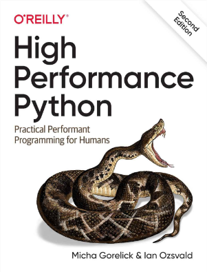
Our snake is a Fer-de-Lance (which even has its own unofficial flag) and which also happens to be a ship from the classic spacefaring game Elite.
We plan to develop the book in a collaborative way based on some lessons I learned last time.
Ian is a Chief Interim Data Scientist via his Mor Consulting. Sign-up for Data Science tutorials in London and to hear about his data science thoughts and jobs. He lives in London, is walked by his high energy Springer Spaniel and is a consumer of fine coffees.
EuroSciPy 2013 write-up
The conference is over, tomorrow I’m sticking around to Sprint on scikit-learn. As last year it has been a lot of fun to catch up with colleagues out here in Brussels. Here’s Logilab’s write-up.
Yesterday I spoke on Building an Open Source Data Science company. Topics included how companies benefit from open sourcing their tools, how individuals benefit by contributing to open source and how to build a consultancy or products.
This led to good questions over lunch. It seems that many people are evaluating whether their future is as predictable as it once was, especially for some in academia.
One question that repeatedly surfaced was “I’m an academic scientist – how do I figure out if my skills are needed in industry?”. My suggestion was simply to phone some nearby recruiters and have an introductory chat (probably via a Google search). Stay in control of the conversation, start from the position that you’re considering a move into industry (so you commit to nothing), build a relationship with the recruiter if you like them via several phone calls (and weed out the idiots – stay in control and just politely get rid of the ones who waste your time).
Almost certainly your science skills will translate into industrial problems (so you won’t have to retrain as a web programmer – a fear expressed by several). One recruitment group I’ve been talking with are the Hydrogen Group, they have contracts for data science throughout Europe. Contact Nick there and mention my name. If you’re in London then talk to Thayer of TeamPrime or look at TechCityJobs and filter by sensible searches.
Another approach is to use a local jobs board (e.g. in London there is TechCityJobs) which lists a healthy set of data science jobs. You can also augment your LinkedIn profile (here’s mine) with the term “data science” as it seems to be the term recruiters know to use to find you. Write a bullet-point list of your skills for data and the tools you use (e.g. Python, R, SPSS, gnuplot, mongodb, Amazon EC2 etc) to held with keyword searches and see who comes to find you (it’ll take months to get a good feel of what people are searching for to find you). In LinkedIn add any talks, open source projects etc that you contribute to as these are easy for someone to check to verify your skill level.
(Sidenote – I’m in the Sprint publishing this, I’ve just had a very interesting chat with a nascent company about how much they want to open source and the benefits and trade offs of doing so in their optics industry. Knowing why you attract user-attention, what you might give away to competitors, how much time you might lose in supporting non-commercial users whilst demonstrating your competence through open source is critical to making a reasoned decision. Related to this chat – posts on switching from [L]GPL to BSD 1, 2)
Next on the Friday I was invited to join a panel discussion asking “How do we make more programmers?”. It was nice to discuss some lessons learned teaching millions of beginners through ShowMeDo and by teaching at the intermediate/expert level at Python conferences. Thoughts covered the uses of the IPython Notebook, the depth of tuition to fit the needs of a group and the wealth of teaching material that’s freely available (e.g. pyvideo.org and the pytutor list).
This morning Peter Wang gave the keynote looking at a future for data analysis with Python. The Continuum tool chain is looking very nice, Bokeh and Blaze look to be worth testing now. I’m still curious about the limitations of Numba, I suspect that common use cases are still a way from being covered.
During the conference I got to learn about cartopy (a bit of a pain to setup but they promise that process will improve) which is a very compelling replacement for basemap, vispy is a cool looking OpenGL based visualiser for large datasets and I learned how to install the IPython Notebook in one go using ‘pip install ipython[notebook]’.
Overall I’ve had fun again and am very grateful to be part of such a smart and welcoming community.
Ian is a Chief Interim Data Scientist via his Mor Consulting. Sign-up for Data Science tutorials in London and to hear about his data science thoughts and jobs. He lives in London, is walked by his high energy Springer Spaniel and is a consumer of fine coffees.
Read my book
Oreilly High Performance Python by Micha Gorelick & Ian Ozsvald AI Consulting
Co-organiser
Trending Now
1Leadership discussion session at PyDataLondon 2024Data science, pydata, RebelAI2What I’ve been up to since 2022pydata, Python3Upcoming discussion calls for Team Structure and Buidling a Backlog for data science leadsData science, pydata, Python4My first commit to PandasPython5Skinny Pandas Riding on a Rocket at PyDataGlobal 2020Data science, pydata, PythonTags
Aim Api Artificial Intelligence Blog Brighton Conferences Cookbook Demo Ebook Email Emily Face Detection Few Days Google High Performance Iphone Kyran Laptop Linux London Lt Map Natural Language Processing Nbsp Nltk Numpy Optical Character Recognition Pycon Python Python Mailing Python Tutorial Robots Running Santiago Seb Skiff Slides Startups Tweet Tweets Twitter Ubuntu Ups Vimeo Wikipedia

