Entrepreneurial Geekiness
Visualising London, Brighton and the UK using Geo-Tweets
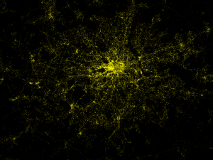
Recently I’ve been grabbing Tweets some some natural language processing analysis (in Python using NetworkX and NLTK) – see this PyCon and PyData conversation analysis. Using the London dataset (visualised in the PyData post) I wondered if the geo-tagged tweets would give a good-looking map of London. It turns out that it does:
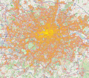
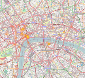
You can see the bright centre of London, the Thames is visible wiggling left-to-right through the centre. The black region to the left of the centre is Hyde Park. If you look around the edges you can even see the M25 motorway circling the city. This is about a week’s worth of geo-filtered Tweets from the Twitter 10% firehose. It is easier to locate using the following Stamen tiles:
Can you see Canary Wharf and the O2 arena to its east? How about Heathrow to the west edge of the map? And the string of reservoirs heading north north east from Tottenham?
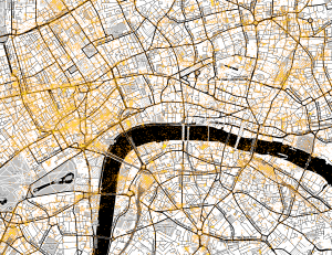
Here’s a zoom around Victoria and London Bridge, we see a lot of Tweets around the railway stations, Oxford Street and Soho. I’m curious about all the dots in the Thames – presumably people Tweeting about their pleasure trips?
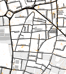
Here’s a zoom around the Shoreditch/Tech City area. I was surprised by the cluster of Tweets in the roundabout (Old Street tube station), there’s a cluster in Bonhill Street (where Google’s Campus is located – I work above there in Central Working). The cluster off of Old Street onto Rivington Street seems to be at the location of the new and fashionable outdoor eatery spot (with Burger Bear). Further to the east is a more pubby/restauranty area.
I’ve yet to analyse the content of these tweets (doing something like phrase extraction from the PyCon/PyData tweets onto this map would be great). As such I’m not sure what’s being discussed, probably a bunch of the banal along with chitchat between people (“I”m on my way”…). Hopefully some of it discusses the nearby environment.
I’m using Seth’s Python heatmap (inspired by his lovely visuals). In addition I’m using Stamen map tiles (via OpenStreetMap). I’m using curl to consume the Twitter firehose via a geo-defined area for London, saving the results to a JSON file which I consume later (shout if you’d like the code and I’ll put it in github) – here’s a tutorial.
During London Fashion Week I grabbed the tagged tweets (for “#lfw’ and those mentioning “london fashion week” in the London area), if you zoom on the official event map you’ll see that the primary Tweet locations correspond to the official venue sites.
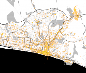
What about Brighton? Down on the south coast (about 1 hour on the train south of London), it is where I’ve spent the last 10 years (before my recent move to London). You can see the coastline, also Sussex University’s campus (north east corner). Western Road (the thick line running west a little way back from the sea) is the main shopping street with plenty of bars.
It’ll make more sense with the Stamen tiles, Brighton Marina (south east corner) is clear along with the small streets in the centre of Brighton:
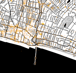
Zooming to the centre is very nice, the North Laines are obvious (to the north) and the pedestriansed area below (the “south laines”) is clear too. Further south we see the Brighton Pier reaching into the sea. To the north west on the edge of the map is another cluster inside Brighton Station:
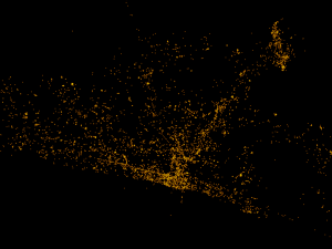
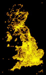
Finally – what about all the geo-tagged Tweets for the UK (annoyingly I didn’t go far enough west to get Ireland)? I’m pleased to see that the entirety of the mainland is well defined, I’m guessing many of the tweets around the coastline are more from pretty visiting points.
How might this compare with a satellite photograph of the UK at night? Population centres are clearly visible but tourist spots are far less visible, the edge of the country is much less defined (via dailymail):
I’m guessing we can use these Tweets for:
- Understanding what people talk about in certain areas (e.g. Oxford Street at rush-hour?)
- Learning why foursquare checkings (below) aren’t in the same place as tweet locations (can we filter locations away by using foursquare data?)
- Seeing how people discuss the weather – is it correlated with local weather reports?
- Learning if people talk about their environment (e.g. too many cars, poor London tube climate control, bad air, too noisy, shops and signs, events)
- Seeing how shops, gigs and events are discussed – could we recommend places and events in real time based on their discussion?
- Figuring out how people discuss landmarks and tourist spots – maybe this helps with recommending good spots to visit?
- Looking at the trail people leave as they Tweet over time – can we figure out their commute and what they talk about before and after? Maybe this is a sort of survey process that happens using public data?
Here are some other geo-based visualisations I’ve recently seen:
- Nice video of Oyster London Underground checkins from 2012 (write-up)
- FourSquare’s 500,000 check-in visualisation (Jan blog post) for the world, zoom on London to see how the map is different to the tweet data I have above
- Another FourSquare check-in visualisation just for London filtered by location-type
- Language-tagged geo-tweets for New York
- Language-tagged geo-tweets for London
- Language-tagged geo-tweets for Europe (uses the Chromium compact language detector)
If you want help with this sort of work then note that I run my own AI consultancy, analysing and visualising social media like Twitter is an active topic for me at present (and will be more so via my planned API at annotate.io).
Ian is a Chief Interim Data Scientist via his Mor Consulting. Sign-up for Data Science tutorials in London and to hear about his data science thoughts and jobs. He lives in London, is walked by his high energy Springer Spaniel and is a consumer of fine coffees.
More Python 3.3 downloads than Python 2.7 for past 3 months
Since PyCon 2013 I’ve been in a set of conversations that start with “should I be using Python 3.3 for science work?”. Here’s a recent reddit thread on the subject. Last year I solidly recommended using Python 2.7 for scientific work (as many key libraries weren’t yet supported). I’m on the cusp of changing my recommendation.
Update there’s a nice thread on Reddit/r/python discussing what’s required and where the numbers are coming from.
I last looked at the rate of Python downloads via ShowMeDo during 2008 when Python 2.5 was the top dog. The Windows 2.5.1 installer was getting 500,000 downloads a month. In the last 3 months I’m pleasantly surprised to see that Python 3.3 for Windows is downloaded more each month than Python 2.7. We can see:
- March 2013 Python 3.3 for Windows has 647k downloads vs Python 2.7 with 630k
- February 2013 Python 3.3 for Windows has 553k downloads vs Python 2.7 with 498k
- January 2013 Python 3.3 for Windows has 533k downloads vs Python 2.7 with 495k (Python 2.7 less popular since January 2013)
- December 2012 Python 3.3 for Windows has 412k downloads vs Python 2.7 with 525k
These figures only tell a part of the story of course. For Windows you have to download Python. On Linux and Mac it comes pre-installed (so we can’t measure those numbers).
Python 2.7 has been the default on Ubuntu for a while, that’s changing with Ubuntu 13.04. There are two lists of Python-3 compatible packages, it seems that Django is on this list and at PyCon there was a how-to-port-to-py3 video (not Flask yet update Armin is tweeting for sprint help for Py3 support), SQLAlchemy is (but not MySQL-python), Fabric isn’t ready yet. For web-dev it seems to be a mixed bag but I’m guessing Python 3 support will be across the board this year.
For scientific use we already have Python-3 compatible numpy, scipy and matplotlib. scikit-learn is ‘nearly‘ ported, Pillow (the recent fork of PIL) is ready for Python 3. NLTK is also being ported.
For scientific use around natural language processing the switch to unicode-by-default looks most attractive (the mix of strings and unicode datatypes has burnt hours for me over the years in Python 2.x). Here’s a PyCon video on the use of Python 3 for text processing and this reviews why Python 3.3 is superior to Python 2.7.
It is slightly too early for me yet to want to switch but I’m starting to experiment. I’ve added some __future__ imports to new code so I know I’m writing Python 2.7 in a 3-like style. I’m also increasingly using Ned Batchelder’s coverage.py via nosetests to make sure I have good coverage. I currently run 2to3 to check that things convert cleanly to Python 3 but rarely run the result with Python 3 (I haven’t needed to do this yet). There’s a set of useful advice on python3porting including various __future__ imports (including division, print_function, unicode_literals, absolute_import).
Ian is a Chief Interim Data Scientist via his Mor Consulting. Sign-up for Data Science tutorials in London and to hear about his data science thoughts and jobs. He lives in London, is walked by his high energy Springer Spaniel and is a consumer of fine coffees.
Applied Parallel Computing (PyCon 2013 Tutorial) slides and code
Minesh B. Amin (MBASciences) and I (Mor Consulting Ltd) taught Applied Parallel Computing over 3 hours at PyCon 2013. PyCon this year was a heck of a lot of fun, I did the fun run (mentioned below), received one of the free 2500 RaspberryPis that were given away, met an awful lot of interesting people and ran two birds-of-a-feather sessions (parallel computing for our tutorial, another on natural language processing).
I held posting this entry until the video was ready (it came out yesterday). All the code and slides are in the github repo. Currently (but not indefinitely) there’s a VirtualBox image with everything (Redis, Disco etc) pre-installed.
After the conference, partly as a result of the BoF NLP session I created a Twitter graph “Concept Map” based on #pycon tweets, then another for #pydata. They neatly summarise many of the topics of conversation.
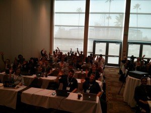
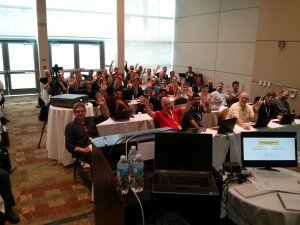
Here’s our room of 60+ students, slides and video are below:
The video runs for 2 hours 40:
Here’s a list of our slides:
- Intro to Parallelism (Minesh)
- Lessons Learned (Ian)
- List of Tasks with Mandelbrot set (Ian)
- Map/Reduce with Disco (Ian)
- Hyperparameter optimisation with grid and random search (Minesh)
These are each of the slide decks:
I also had fun in the 5k fun run (coming around 77th of 150 runners), we raised $7k or so for cancer research and the John Hunter Memorial Fund.
Ian is a Chief Interim Data Scientist via his Mor Consulting. Sign-up for Data Science tutorials in London and to hear about his data science thoughts and jobs. He lives in London, is walked by his high energy Springer Spaniel and is a consumer of fine coffees.
Analysing #pydata, London and Brighton tweets for concept mapping
Below I’ve visualised tweets for #PyData conference and the cities of London and Brighton – this builds on my ‘concept cloud‘ from a few days ago at the #PyCon conference. Props to Maksim for his Social Media Analysis tutorial for inspiration.
Update – Maksim’s Analying Social Networks tutorial video is online.
For the earlier #PyCon 2013 analysis I visualised #hashtags and @usernames from #pycon tagged tweets during the conference. I’ve built upon this to add some natural language processing for ‘noun phrase extraction’ which I detail below – this helps me to pull out phrases that are descriptive but haven’t been tagged. It also helps us to see which people are connected with which subjects. For the PyCon analysis I collected 22k tweets, after removing retweets I was left with 7,853 for analysis.
#PyData (PyData Santa Clara 2013)
PyData 2013 is a much smaller conference than PyCon (PyCon had 2,500 people and 20% female attendance, PyData had around 400 with 10% female attendance). Being smaller it had far fewer tweets – after removing retweets I had just 225 tweets to analyse. Cripes! This is clearly not big data. The other problem was that people weren’t using many #hashtags, they were referring to topics using natural language. For example:
“Peter Norvig was giving a talk at PyData in Santa Clara, CA on the topic of innovation in education.” (source)
Clearly some natural language processing was required. I took two approaches:
- Extract capitalised sub-phrases (e.g. “Peter Norvig”, “Santa Clara”) of one or more words
- Use NLTK’s bigram collocation analyser (to find lowercased phrases such as “ipython notebook”, “machine learning”)
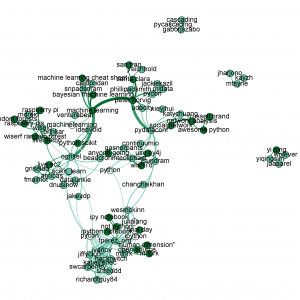
Starting at the bottom of the plot we see three types of colour:
- white is for #hashtags
- light blue is for @usernames
- dark green is for phrases (extracted using natural language processing)
We see a cluster of references around @fperez_org (Fernando Perez of IPython), one cluster is around @swcarpentry (the scientist-friendly software carpentry movement), the other is around IPython and the IPython Notebook (@minrk of IPython/parallel is linked too). I like the connection to Julia – Fernando discussed during his keynote that Julia now interoperates with Python.
The day before we had Peter Norvig (Director of research at Google) giving a keynote on the use of Python in education at Udacity including a discussion of how machine learning could be used to identify the mistakes that new coders make so we could make friendlier error messages to help students correct their code. See the clustering around this at the top of the graph.
Later the same day Henrik (@brinkar) spoke on Wise.io‘s Random Forest classifier. Their approach was efficient enough to demo live on a RaspberryPi. The connection from Peter to Henrik goes via #venturebeat who covered wise.io’s new software release during the conference.
Connecting IPython and Wise.io is @ogrisel (Olivier Grisel) of scikit-learn. He gave an impressive (and given the variability of conference wifi – slightly ballsy) live demo of scaling a machine learning system via IPython Parallel on EC2.
In the middle we see @teoliphant (Travis Oliphant) joined to Continuum (his company). Off to the right I get to blow my own trumpet – the phrases “awesome python” and “network analysis” connect to “russel brand” which is how one wag described my lightning talk. I got a chance to demo the earlier version of this at the end of @katychuang‘s talk on networkx.
London (geo-tagged tweets)
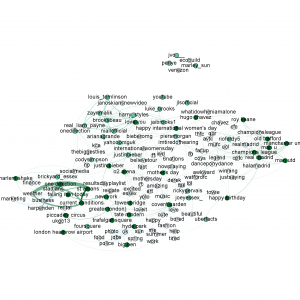
For the last month I’ve been grabbing tweets in the London geo area for another project. I had to raise my filtering levels to bring the network down to a sane (and easily visualised) number of nodes. After removing ReTweets I have 497,771 tweets from just a subset of my data. Some obvious clusters can be seen:
- #weather and #rain and (presumably a rather wet) “St Albans” (a very British discussion)
- The “O2 Arena” near the centre with “Justin Beiber” and #believetour, linked with #amazing, #excited, #nowplaying
- @onedirection must have been playing (connected with band members @louis_tomlinson and @real_liam_payne amongst others)
- To the top-right we have a football cluster with “Manchester United”, “Champions League”, #cpfc, #realmadrid and “Old Trafford”
- The usual tourist spots like “Tower Bridge”, “Covent Garden”, “Hyde Park”, “Big Ben”, “Trafalgar Square” are discussed with #happy #sun #loveit, linked just off of here is “London Heathrow Airport” and “New York”
Brighton (geo-tagged tweets)
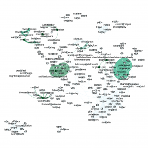
This is my favourite, analysed using 40,379 tweets after removing ReTweets. The nature of the two cities (Brighton is 50 miles south of London on the coast, it is a university town with a young & party-friendly population) is quite apparent:
- Top left there is discussion around “One Direction”, #justinbeiber and #seo (a particular Brighton tech thing)
- Just south of @justinbieber is a single chain of not-safe-for-work ranting (another particular Brighton thing)
- If you jump to the bottom right you’ll see #underwear, #lingerie, #teenagers – not as dodgy as you might expect, Sweetling were doing a social media bra campaign
- #hove is joined with #sunny #morning and nearby places #lewes #shoreham
- #brightonbeach and “Brighton Pier” connect with #birds (Seagulls – a bane!) and #sun
- #friends, #memories#, #happy, #goodtimes, #marina, #fun, #girls cluster around the centre (Brighton does like a party)
- Off down to the bottom left is a some sort of political discussion (what were they doing in Brighton?)
Reproducing this
All the code is in github at twitter_networkx_concept_map including the one line cURL command to capture the data. An example .gephi file is included for visualisation in Gephi. The built-in networkx viewer (optionally using GraphViz) works reasonably well but isn’t interactive. Maksim’s tutorial and utils class were jolly useful (utils is in my repo), I’m also using twitter-text-python for parsing @usernames, #hashtags and URLs from the tweets.
If you want some custom work around this, give me a shout via Mor Consulting.
Ian is a Chief Interim Data Scientist via his Mor Consulting. Sign-up for Data Science tutorials in London and to hear about his data science thoughts and jobs. He lives in London, is walked by his high energy Springer Spaniel and is a consumer of fine coffees.
Semantic map of PyCon2013 Twitter Topics
Maksim taught a lovely Social Graph Analytics course at PyCon the day before I taught Applied Parallel Computing. I took his demo for a “poor mans LDA/LSI analysis” of a Twitter topic (rather than using full LDA it just uses co-incident hashtags) and added usernames to produce the plot below.
Update – Analysing #pydata conference (and the cities London and Brighton) tweets using NLTK and NetworkX added as a second post.
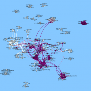
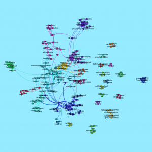
White nodes are hashtags (e.g. #raspberrypi centres the left white cluster), purple is for usernames (e.g. organiser @jessenoller is in the centre, Python’s creator @gvanrossum is between #raspberrypi and Jesse, @dabeaz and @raymondh are near the centre). We see a strongly connected cluster of people and hashtags along with several disconnected sets.
Over the course of PyCon I’ve collected all the #pycon tagged Tweets using the 1% Twitter Firehose (via a 1 line curl command). I have some Tweet parsing code which transforms this data into useful subsets (originally I was working on 2D geo-tagged plots of London and Brighton – to be posted later), in this case I extract the hashtags and usernames from each tweet using twitter-text-python and and then build edges in a graph for each pair of mentions that occur in a tweet. E.g.:
“really cool stenography talk by @stenoknight at #PyCon – she still uses #vim with #plover”
will cause a link to form between #pycon and #vim, #pycon and #plover, #vim and #plover. The width of edges in the diagram corresponds to the number of times the same hashtags (and users) are linked in each tweet. To understand which people are related to each concept I added usernames so in the above example edges are also formed between @stenoknight and the three hashtags.
If you open up a larger version of the image (click the main image) you can follow some of the detail. The #raspberrypi tag is interesting – lots of prominent projects are mentioned alongside (e.g. #pandas, #django). Just below the main cluster is a subcluster on #robots #vision #hackers – these are joined to the main #raspberrypi cluster by the adjective #awesome (rather lovely!). All 2,500 attendees of PyCon were given a full Raspberry Pi Model B during the Friday morning keynote by Eben Upton and during the weekend a RaspberryPi hacklab taught many people how to add hardware and use Python on the device.
In the centre we see a lot of people – many people mention each other or are linked by others (e.g. prominent speakers) in their tweets. I filter out ReTweets so we’re only looking at mentions of people inside one tweet if someone has written that tweet afresh. The legendary Testing in Python Birds of a Feather session (#tipbof) on the right is linked to a few prominent folk.
#openscience and #openaccess are well linked to the south of the main cluster, connected to the main group via clusters of people.
I’m quite intrigued by the @styleseat link out to #nailjerks #pixiedust #nailart to the north, they ran a manicure/pedicure session in connection with #pyladies.
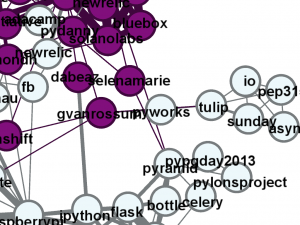
Guido gave a keynote this morning and discussed async programming – a new cluster formed (see zoom from earlier analysis shown above) from yesterday’s data with #tulip #sunday #pep3156 whilst talking about PEP 3156. It is interesting to note the time-based nature of the clusters (which we can’t see in this single 2D image, maybe I ought to animate it?).
Update I’ve added the plot below using the Community Detection feature of Gephi, it shows Guido’s async tag set as a separate cluster. #raspberrypi has a nicely large cluster, web servers have their own too.
Due to yesterday’s PyCon 5k Fun Run there’s a disconnected cluster for #10minutemile #shootforthestars #ugh to the north – 150 of us (of 2500 attendees) ran at 7am, we raised $7k towards cancer research.
It is worth mentioning that I removed some of the more prominent nodes as many of the other topics connect to these so they add little information:
- #pycon
- #python
- #pycon2013
- @pycon
- @top_webtech @inowgb (spammy)
- any username node with less than 50 occurrences
- any hashtag node with only 1 occurrence
I’ll add the code to github tomorrow. Tools used include twitter-text-python, networkx and Gephi. Update the code is in github as twitter_networx_concept_map.
If I get time whilst here I’ll do some more analysis on the data. I’d love to use a named entity tool or some parsing to extract obvious nouns (e.g. packages and topics) that aren’t #hashtagged.
Ian is a Chief Interim Data Scientist via his Mor Consulting. Sign-up for Data Science tutorials in London and to hear about his data science thoughts and jobs. He lives in London, is walked by his high energy Springer Spaniel and is a consumer of fine coffees.
Read my book

Oreilly High Performance Python by Micha Gorelick & Ian Ozsvald AI Consulting
Co-organiser
Trending Now
1Leadership discussion session at PyDataLondon 2024Data science, pydata, RebelAI2What I’ve been up to since 2022pydata, Python3Upcoming discussion calls for Team Structure and Buidling a Backlog for data science leadsData science, pydata, Python4My first commit to PandasPython5Skinny Pandas Riding on a Rocket at PyDataGlobal 2020Data science, pydata, PythonTags
Aim Api Artificial Intelligence Blog Brighton Conferences Cookbook Demo Ebook Email Emily Face Detection Few Days Google High Performance Iphone Kyran Laptop Linux London Lt Map Natural Language Processing Nbsp Nltk Numpy Optical Character Recognition Pycon Python Python Mailing Python Tutorial Robots Running Santiago Seb Skiff Slides Startups Tweet Tweets Twitter Ubuntu Ups Vimeo Wikipedia
