Entrepreneurial Geekiness

Some Natural Language Processing and ML Papers
After I spoke at DataScienceLondon in June I was given a set of paper references by a couple of people (the bulk were by Levente Török) – thanks to all. They’re listed below. Along the same lines I have one machine learning paper aimed at beginners to recommend (“A Few Useful Things to Know about Machine Learning” – Pedro Domingos), it gives a set of real-world examples to work off, useful for someone short on experience who wants to learn whilst avoiding some of the worse mistakes.
Selection of references in no particular order:
Deep Learning for Efficient Discriminative Parsing, Ronan Collobert
A Unified Architecture for Natural Language Processing: Deep Neural Networks with Multitask Learning, Ronan Collobert
Latent Dirichlet Allocation (old article)
Fast Collapsed Gibbs Sampling For Latent Dirichlet Allocation
Rethinking LDA: Why priors matter (How to tune the hyper parameters which shouldn’t matter.)
Dynamic Topic Models and the Document Influence Model (in which they deal with the change of the hidden topics ( HMM))
Semi supervised topic model notes:
Semi-supervised Extraction of Entity Aspects using Topic Models
Hierarchically Supervised Latent Dirichlet Allocation
Melting the huge difference between the topic models and the bag of words approach:
Beyond Bag of words (presentation)
Integrating Topics with Syntax
Collective Latent Dirichlet Allocation (might be useful for Tweet collections)
R packages (from Levente):
R Text Tools package (noted as most advanced package, website offline when I visited it)
Ian is a Chief Interim Data Scientist via his Mor Consulting. Sign-up for Data Science tutorials in London and to hear about his data science thoughts and jobs. He lives in London, is walked by his high energy Springer Spaniel and is a consumer of fine coffees.
Overfitting with a Decision Tree
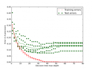
Below is a plot of Training versus Testing errors using a Precision metric (actually 1.0-precision, so lower is better) that shows how easy it is to over-fit a decision tree to the detriment of generalisation. It is important to check that a classifier isn’t overfitting to the training data such that it is just learning the training set, rather than generalising to the true patterns that make up the entire dataset. It will only be a good a good predictor on unseen data if it has generalised to the true patterns.
Looking at the first column (depth 1 decision tree) the training error (red) is around 0.29 (so the Precision is around 71%). If we look at the exported depth 1 decision tree (1 page pdf) we see that it picks out 1 feature (“http”) as the most informative feature to split the dataset (ignore the threshold, that’s held at a constant 0.5 as we only have 0 or 1 values in our training matrix). It has 935 samples in the dataset with 465 in class 0 (not-a-brand) and 470 in class 1 (is-the-brand).
The right sub-tree is chosen if the term “http” is seen in the tweet. In that case the the training set is left with 331 samples of which 95 are class 0 and 236 are class 1. 1.0/331*236 == 71%. If “http” isn’t seen then the left branch is taken where 234 class 1 samples are given a false negative labelling.
As we allow greater depth in the decision tree we see both the training and the testing error improves. By around depth 35 we have a very low training error and (roughly) the optimum testing error. By allowing the decision tree to add new branches it overfits, becoming a great predictor for the training set (the error goes to 0) but with worsening testing errors (the thin green line is the average – it increases past a depth of 35 layers). Decision trees tend to overfit due to their greedy nature.
I’ve added an example of a depth 50 (1 page pdf) decision tree if you’re curious. The social media disambiguator project has example code (learn1_biasvar.py) to generate this plot.
Ian is a Chief Interim Data Scientist via his Mor Consulting. Sign-up for Data Science tutorials in London and to hear about his data science thoughts and jobs. He lives in London, is walked by his high energy Springer Spaniel and is a consumer of fine coffees.
Visualising True Positives and False Positives against Features with scikit-learn
Here I’m starting to look into the errors caused in the social media brand disambiguator project. Below I look at true and false positives (correct and mistaken is-a-brand classifications) and plot them against the number of features that two different classifiers can use to calculate their class membership probabilities.
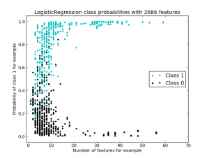
First I’m using the default LogisticRegression classifier. For both of these examples I’m using (1,3) n-grams (uni-, bi- and tri-grams) and a minimum document frequency of 2 occurrences for a term when building the Binary Vectorizer. The Vectorizer is constructed inside a 5-fold cross validation loop, so the number of features found varies a little per fold (you can see this in the two image titles – the title is generated using the final CV Vectorizer).
Class 1 (is-a-brand) results are ‘light blue’, they cluster towards the top of the graph (towards probability of 1 of being-in-class-1). Class 0 (is-not-a-brand) results cluster towards the bottom (towards a probability of 0 of being-in-class-1). There’s a lot of mixing around P(0.5) as the two classes aren’t separated terribly well.
We can see that the majority of the points (each circle ignoring which class it is in) have 1 to 10 features by looking along the x-axis, a few go up to over 50 features. Since the features include bi- and tri-grams we’ll see a lot of redundant features for these examples.
If we imagine drawing a threshold for is-class-1 above 0.89 then between all the cross validation test results (584 items across the 5 folds) I’d have 349 true positives (giving 100% precision, 59% recall). If I set the threshold to 0.78 then I’d have 422 true positives and 4 false positives (the 4 black dots above 0.78 giving 99% precision and 72% recall).
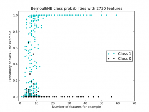
Now I repeat the experiment with the same Vectorizer settings but changing the classifier to Bernoulli Naive Bayes. The diagram shows a much stronger separation between the two classes:
If I choose a threshold of 0.66 then I have 100% precision with 66% recall. If I choose 0.28 then I get 2 false positives giving 99.5% precision with 73% recall. It is nice to be able to visualise the class separations for each of the test rows, to both have a feel for how the classifier is doing and to view how changing the feature set (without modifying the classifier) changes the results.
Looking at these results I’d obviously want to diagnose what the false positive results look like, maybe that gives further ideas for features that could help to separate the two classes. The modifications to learn1_experiments.py are in this check-in on the github project.
Ian is a Chief Interim Data Scientist via his Mor Consulting. Sign-up for Data Science tutorials in London and to hear about his data science thoughts and jobs. He lives in London, is walked by his high energy Springer Spaniel and is a consumer of fine coffees.
Visualising the internals of Logistic Regression on a Text Matrix
Below I have some plots that visualise the term matrix (as a binary matrix and as a TF-IDF matrix) for the brand disambiguation project followed by a visualisation of the coefficients used in scikit-learn’s LogisticRegression classifier using l1 and l2 penalties.
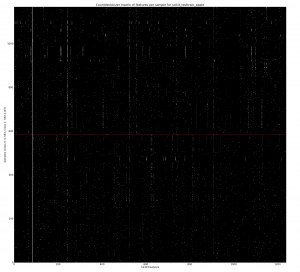
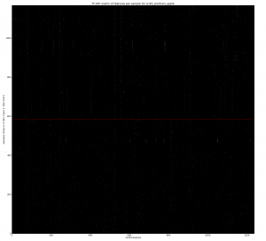
Using a CountVectorizer with binary=True we can mark the absence or presence of a token in a tweet. This is generated using learn1.py with the –termmatrix argument. If you open the full version of the image you’ll see that Class 0 is the bottom half (below the red line) of the rows, Class 1 is the top half (with 1168 rows in total, equally split between the classes). The x-axis shows 1238 features (formed of all unigrams and bigrams by the default tokenizer with a minimum document frequency of 2). The strong white line on the left is for the token ‘apple’ which is present in all tweets. If you look carefully you can see that some terms occur more frequently in only one of the two classes (as we’d hope).
The repeated rows are due to retweets – they have the same terms so we get repeated sets of the same binary features. This probably distorts the learning a bit and these will be removed in a later experiment.
Next we do the same operation but use TF-IDF (wikipedia) to scale the values (so they’re in the range 0-1.0), higher values mean that the tokens are rarer and so should have more importance. Often you’d use TF-IDF to normalise for document length (longer documents have more words and so in a binary matrix you’d have more 1s represented). Tweets are of roughly the same length so I don’t think this is so useful, I don’t know what the effect will be on precision and recall in later testing. As you’d expect the most common terms (e.g. ‘apple’) now have a low value, a few rare words now have a high (bright) value.
An obvious question given the above plots is whether we can easily remove a number of the tokens due to them contributing little towards a classification, either because they’re mentioned equally for both classes (e.g. common English words would be mentioned roughly equally and would have no bearing on the classification problem) or because they occur so rarely that we don’t know if they truly represent a feature that should identify a class. This will be investigated soon.
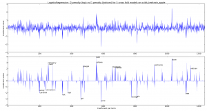
Next we create a LogisticRegression classifier with learn1_coefficients.py and train it first with the default l2 penalty and then with an l1 penalty. We can see that the l1 penalty sets many of the coefficients to 0. In both plots we’re looking at the coefficients for each of 5 cross-fold models (the dark lines mean more models agree on the importance of the feature, each model is plotted with an alpha blend). For the l1 penalty I’ve annotated the 10 biggest coefficients for the positive and negative coefficients. This chart is plotted using a Binary CountVectorizer (from the first of the two examples above) – if I switch to a TF-IDF Vectorizer then I get a very similar visual output.
As you might expect for the apple-the-brand coefficients we see “cook, company, google, ipad, iphone, macbook, market, samsung, store, vatican” (I’ll explain “vatican” in a moment). For not-apple-the-brand we see “candy, caramel, cinnamon, eat, eye, girl, juice, orange, pie, tree“.
The inclusion of “vatican” happens because these tweets occur with the announcement of the latest Pope – various wags tweeted about topics like the “iPope” and so “vatican” is discussed alongside apple-the-brand. This also highlights the over-fitting that has inevitably occurred due to the current small sample of tweets for this experiment.
Clearly we could use the l1 penalty to perform feature selection, we can also use other methods. This is to follow.
Ian is a Chief Interim Data Scientist via his Mor Consulting. Sign-up for Data Science tutorials in London and to hear about his data science thoughts and jobs. He lives in London, is walked by his high energy Springer Spaniel and is a consumer of fine coffees.
Demonstrating the first Brand Disambiguator (a hacky, crappy classifier that does something useful)
Last week I had the pleasure of talking at both BrightonPython and DataScienceLondon to about 150 people in total (Robin East wrote-up the DataScience night). The updated code is in github.
The goal is to disambiguate the word-sense of a token (e.g. “Apple”) in a tweet as being either the-brand-I-care-about (in this case – Apple Inc.) or anything-else (e.g. apple sauce, Shabby Apple clothing, apple juice etc). This is related to named entity recognition, I’m exploring simple techniques for disambiguation. In both talks people asked if this could classify an arbitrary tweet as being “about Apple Inc or not” and whilst this is possible, for this project I’m restricting myself to the (achievable, I think) goal of robust disambiguation within the 1 month timeline I’ve set myself.
Below are the slides from the longer of the two talks at BrightonPython:
As noted in the slides for week 1 of the project I built a trivial LogisticRegression classifier using the default CountVectorizer, applied a threshold and tested the resulting model on a held-out validation set. Now I have a few more weeks to build on the project before returning to consulting work.
Currently I use a JSON file of tweets filtered on the term ‘apple’, obtained using the free streaming API from Twitter using cURL. I then annotate the tweets as being in-class (apple-the-brand) or out-of-class (any other use of the term “apple”). I used the Chromium Language Detector to filter non-English tweets and also discard English tweets that I can’t disambiguate for this data set. In total I annotated 2014 tweets. This set contains many duplicates (e.g. retweets) which I’ll probably thin out later, possibly they over-represent the real frequency of important tokens.
Next I built a validation set using 100 in- and 100 out-of-class tweets at random and created a separate test/train set with 584 tweets of each class (a balanced set from the two classes but ignoring the issue of duplicates due to retweets inside each class).
To convert the tweets into a dense matrix for learning I used the CountVectorizer with all the defaults (simple tokenizer [which is not great for tweets], minimum document frequency=1, unigrams only).
Using the simplest possible approach that could work – I trained a LogisticRegression classifier with all its defaults on the dense matrix of 1168 inputs. I then apply this classifier to the held-out validation set using a confidence threshold (>92% for in-class, anything less is assumed to be out-of-class). It classifies 51 of the 100 in-class examples as in-class and makes no errors (100% precision, 51% recall). This threshold was chosen arbitrarily on the validation set rather than deriving it from the test/train set (poor hackery on my part), but it satisfied me that this basic approach was learning something useful from this first data set.
The strong (but not generalised at all!) result for the very basic LogisticRegression classifier will be due to token artefacts in the time period I chose (March 13th 2013 around 7pm for the 2014 tweets). Extracting the top features from LogisticRegression shows that it is identifying terms like “Tim”, “Cook”, “CEO” as significant features (along with other features that you’d expect to see like “iphone” and “sauce” and “juice”) – this is due to their prevalence in this small dataset (in this set examples like this are very frequent). Once a larger dataset is used this advantage will disappear.
I’ve added some TODO items to the README, maybe someone wants to tinker with the code? Building an interface to the open source DBPediaSpotlight (based on WikiPedia data using e.g. this python wrapper) would be a great start for validating progress, along with building some naive classifiers (a capital-letter-detecting one and a more complex heuristic-based one, to use as controls against the machine learning approach).
Looking at the data 6% of the out-of-class examples are retweets and 20% of the in-class examples are retweets. I suspect that the repeated strings are distorting each class so I think they need to be thinned out so we just have one unique example of each tweet.
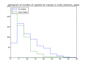
Counting the number of capital letters in-class and out-of-class might be useful, in this set a count of <5 capital letters per tweet suggests an out-of-class example:
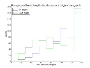
This histogram of tweet lengths for in-class and out-of-class tweets might also suggest that shorter tweets are more likely to be out-of-class (though the evidence is much weaker):
Next I need to:
- Update the docs so that a contributor can play with the code, this includes exporting a list of tweet-ids and class annotations so the data can be archived and recreated
- Spend some time looking at the most-important features (I want to properly understand the numbers so I know what is happening), I’ll probably also use a Decision Tree (and maybe RandomForests) to see what they identify (since they’re much easier to debug)
- Improve the tokenizer so that it respects some of the structure of tweets (preserving #hashtags and @users would be a start, along with URLs)
- Build a bigger data set that doesn’t exhibit the easily-fitted unigrams that appear in the current set
Longer term I’ve got a set of Homeland tweets (to disambiguate the TV show vs references to the US Department and various sayings related to the term) which I’d like to play with – I figure making some progress here opens the door to analysing media commentary in tweets.
Ian is a Chief Interim Data Scientist via his Mor Consulting. Sign-up for Data Science tutorials in London and to hear about his data science thoughts and jobs. He lives in London, is walked by his high energy Springer Spaniel and is a consumer of fine coffees.
Read my book

Oreilly High Performance Python by Micha Gorelick & Ian Ozsvald AI Consulting
Co-organiser
Trending Now
1Leadership discussion session at PyDataLondon 2024Data science, pydata, RebelAI2What I’ve been up to since 2022pydata, Python3Upcoming discussion calls for Team Structure and Buidling a Backlog for data science leadsData science, pydata, Python4My first commit to PandasPython5Skinny Pandas Riding on a Rocket at PyDataGlobal 2020Data science, pydata, PythonTags
Aim Api Artificial Intelligence Blog Brighton Conferences Cookbook Demo Ebook Email Emily Face Detection Few Days Google High Performance Iphone Kyran Laptop Linux London Lt Map Natural Language Processing Nbsp Nltk Numpy Optical Character Recognition Pycon Python Python Mailing Python Tutorial Robots Running Santiago Seb Skiff Slides Startups Tweet Tweets Twitter Ubuntu Ups Vimeo Wikipedia
