Below I have some plots that visualise the term matrix (as a binary matrix and as a TF-IDF matrix) for the brand disambiguation project followed by a visualisation of the coefficients used in scikit-learn’s LogisticRegression classifier using l1 and l2 penalties.
Using a CountVectorizer with binary=True we can mark the absence or presence of a token in a tweet. This is generated using learn1.py with the –termmatrix argument. If you open the full version of the image you’ll see that Class 0 is the bottom half (below the red line) of the rows, Class 1 is the top half (with 1168 rows in total, equally split between the classes). The x-axis shows 1238 features (formed of all unigrams and bigrams by the default tokenizer with a minimum document frequency of 2). The strong white line on the left is for the token ‘apple’ which is present in all tweets. If you look carefully you can see that some terms occur more frequently in only one of the two classes (as we’d hope).
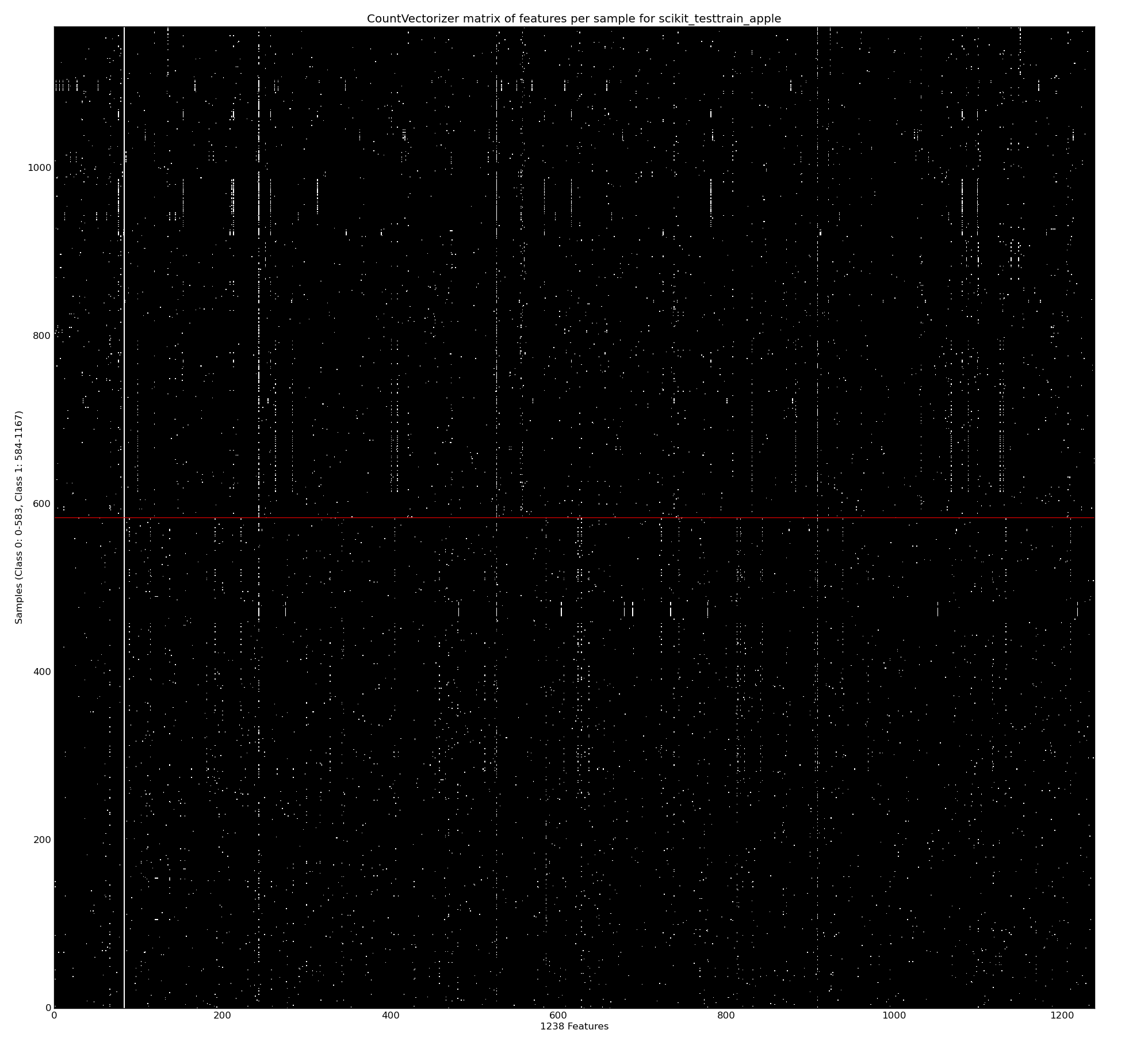
The repeated rows are due to retweets – they have the same terms so we get repeated sets of the same binary features. This probably distorts the learning a bit and these will be removed in a later experiment.
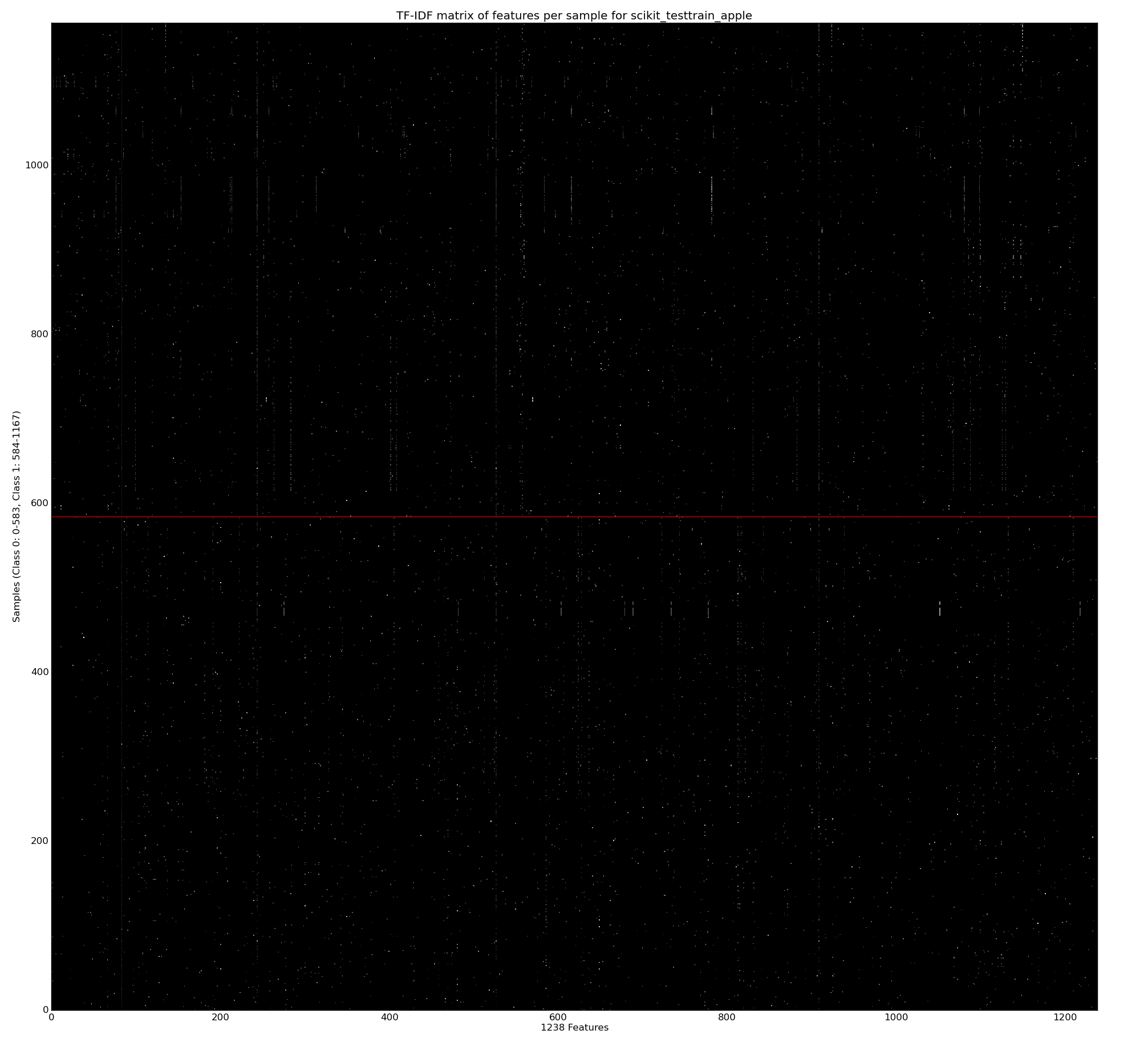
Next we do the same operation but use TF-IDF (wikipedia) to scale the values (so they’re in the range 0-1.0), higher values mean that the tokens are rarer and so should have more importance. Often you’d use TF-IDF to normalise for document length (longer documents have more words and so in a binary matrix you’d have more 1s represented). Tweets are of roughly the same length so I don’t think this is so useful, I don’t know what the effect will be on precision and recall in later testing. As you’d expect the most common terms (e.g. ‘apple’) now have a low value, a few rare words now have a high (bright) value.
An obvious question given the above plots is whether we can easily remove a number of the tokens due to them contributing little towards a classification, either because they’re mentioned equally for both classes (e.g. common English words would be mentioned roughly equally and would have no bearing on the classification problem) or because they occur so rarely that we don’t know if they truly represent a feature that should identify a class. This will be investigated soon.
Next we create a LogisticRegression classifier with learn1_coefficients.py and train it first with the default l2 penalty and then with an l1 penalty. We can see that the l1 penalty sets many of the coefficients to 0. In both plots we’re looking at the coefficients for each of 5 cross-fold models (the dark lines mean more models agree on the importance of the feature, each model is plotted with an alpha blend). For the l1 penalty I’ve annotated the 10 biggest coefficients for the positive and negative coefficients. This chart is plotted using a Binary CountVectorizer (from the first of the two examples above) – if I switch to a TF-IDF Vectorizer then I get a very similar visual output.
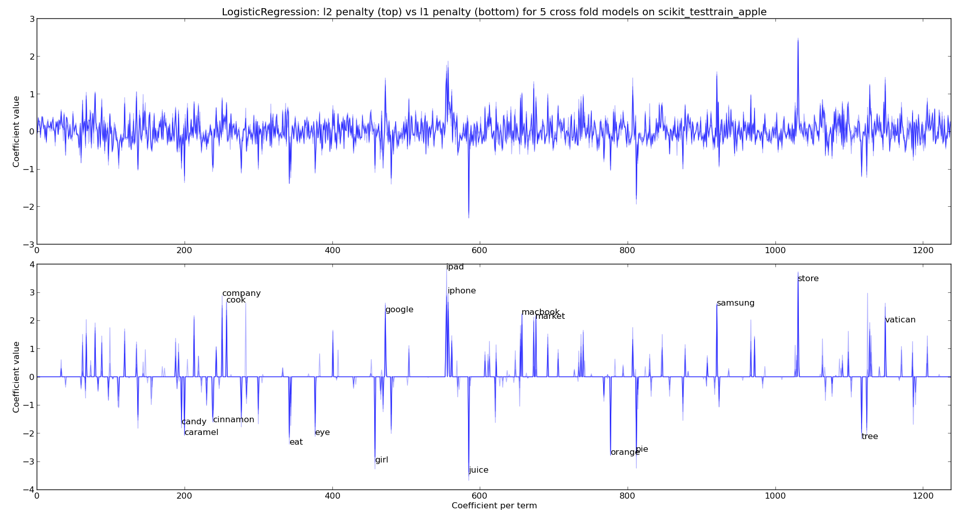
As you might expect for the apple-the-brand coefficients we see “cook, company, google, ipad, iphone, macbook, market, samsung, store, vatican” (I’ll explain “vatican” in a moment). For not-apple-the-brand we see “candy, caramel, cinnamon, eat, eye, girl, juice, orange, pie, tree“.
The inclusion of “vatican” happens because these tweets occur with the announcement of the latest Pope – various wags tweeted about topics like the “iPope” and so “vatican” is discussed alongside apple-the-brand. This also highlights the over-fitting that has inevitably occurred due to the current small sample of tweets for this experiment.
Clearly we could use the l1 penalty to perform feature selection, we can also use other methods. This is to follow.
Ian is a Chief Interim Data Scientist via his Mor Consulting. Sign-up for Data Science tutorials in London and to hear about his data science thoughts and jobs. He lives in London, is walked by his high energy Springer Spaniel and is a consumer of fine coffees.
2 Comments