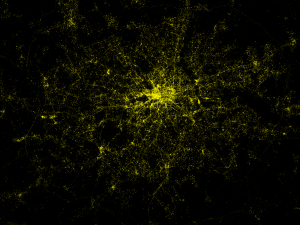
Recently I’ve been grabbing Tweets some some natural language processing analysis (in Python using NetworkX and NLTK) – see this PyCon and PyData conversation analysis. Using the London dataset (visualised in the PyData post) I wondered if the geo-tagged tweets would give a good-looking map of London. It turns out that it does:
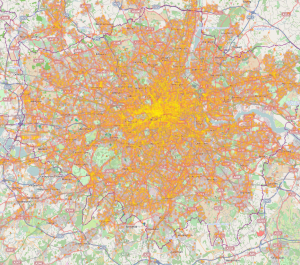
You can see the bright centre of London, the Thames is visible wiggling left-to-right through the centre. The black region to the left of the centre is Hyde Park. If you look around the edges you can even see the M25 motorway circling the city. This is about a week’s worth of geo-filtered Tweets from the Twitter 10% firehose. It is easier to locate using the following Stamen tiles:
Can you see Canary Wharf and the O2 arena to its east? How about Heathrow to the west edge of the map? And the string of reservoirs heading north north east from Tottenham?
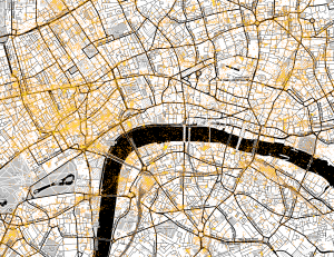
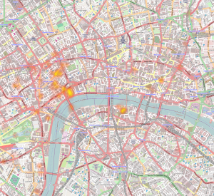
Here’s a zoom around Victoria and London Bridge, we see a lot of Tweets around the railway stations, Oxford Street and Soho. I’m curious about all the dots in the Thames – presumably people Tweeting about their pleasure trips?
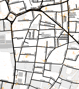
Here’s a zoom around the Shoreditch/Tech City area. I was surprised by the cluster of Tweets in the roundabout (Old Street tube station), there’s a cluster in Bonhill Street (where Google’s Campus is located – I work above there in Central Working). The cluster off of Old Street onto Rivington Street seems to be at the location of the new and fashionable outdoor eatery spot (with Burger Bear). Further to the east is a more pubby/restauranty area.
I’ve yet to analyse the content of these tweets (doing something like phrase extraction from the PyCon/PyData tweets onto this map would be great). As such I’m not sure what’s being discussed, probably a bunch of the banal along with chitchat between people (“I”m on my way”…). Hopefully some of it discusses the nearby environment.
I’m using Seth’s Python heatmap (inspired by his lovely visuals). In addition I’m using Stamen map tiles (via OpenStreetMap). I’m using curl to consume the Twitter firehose via a geo-defined area for London, saving the results to a JSON file which I consume later (shout if you’d like the code and I’ll put it in github) – here’s a tutorial.
During London Fashion Week I grabbed the tagged tweets (for “#lfw’ and those mentioning “london fashion week” in the London area), if you zoom on the official event map you’ll see that the primary Tweet locations correspond to the official venue sites.
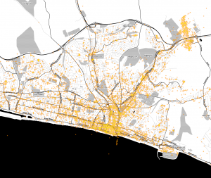
What about Brighton? Down on the south coast (about 1 hour on the train south of London), it is where I’ve spent the last 10 years (before my recent move to London). You can see the coastline, also Sussex University’s campus (north east corner). Western Road (the thick line running west a little way back from the sea) is the main shopping street with plenty of bars.
It’ll make more sense with the Stamen tiles, Brighton Marina (south east corner) is clear along with the small streets in the centre of Brighton:
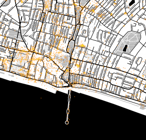
Zooming to the centre is very nice, the North Laines are obvious (to the north) and the pedestriansed area below (the “south laines”) is clear too. Further south we see the Brighton Pier reaching into the sea. To the north west on the edge of the map is another cluster inside Brighton Station:
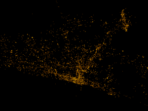
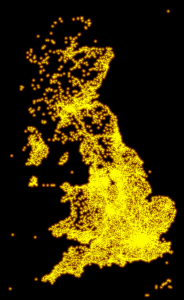
Finally – what about all the geo-tagged Tweets for the UK (annoyingly I didn’t go far enough west to get Ireland)? I’m pleased to see that the entirety of the mainland is well defined, I’m guessing many of the tweets around the coastline are more from pretty visiting points.
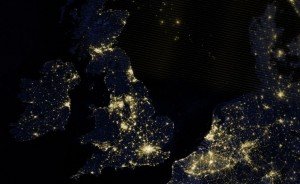
How might this compare with a satellite photograph of the UK at night? Population centres are clearly visible but tourist spots are far less visible, the edge of the country is much less defined (via dailymail):
I’m guessing we can use these Tweets for:
- Understanding what people talk about in certain areas (e.g. Oxford Street at rush-hour?)
- Learning why foursquare checkings (below) aren’t in the same place as tweet locations (can we filter locations away by using foursquare data?)
- Seeing how people discuss the weather – is it correlated with local weather reports?
- Learning if people talk about their environment (e.g. too many cars, poor London tube climate control, bad air, too noisy, shops and signs, events)
- Seeing how shops, gigs and events are discussed – could we recommend places and events in real time based on their discussion?
- Figuring out how people discuss landmarks and tourist spots – maybe this helps with recommending good spots to visit?
- Looking at the trail people leave as they Tweet over time – can we figure out their commute and what they talk about before and after? Maybe this is a sort of survey process that happens using public data?
Here are some other geo-based visualisations I’ve recently seen:
- Nice video of Oyster London Underground checkins from 2012 (write-up)
- FourSquare’s 500,000 check-in visualisation (Jan blog post) for the world, zoom on London to see how the map is different to the tweet data I have above
- Another FourSquare check-in visualisation just for London filtered by location-type
- Language-tagged geo-tweets for New York
- Language-tagged geo-tweets for London
- Language-tagged geo-tweets for Europe (uses the Chromium compact language detector)
If you want help with this sort of work then note that I run my own AI consultancy, analysing and visualising social media like Twitter is an active topic for me at present (and will be more so via my planned API at annotate.io).
Ian is a Chief Interim Data Scientist via his Mor Consulting. Sign-up for Data Science tutorials in London and to hear about his data science thoughts and jobs. He lives in London, is walked by his high energy Springer Spaniel and is a consumer of fine coffees.
13 Comments