I wanted an excuse to play with the Python NetworkX graph visualisation library and recently I joined AdaptiveLab to consult on some data science & visualisation problems. Thus formed the question – how were we all connected together? I figured that looking at who follows us all will yield a little insight into the people we have in common. I’m particularly interested in this question seeing as I was living in Brighton, then lived in Chile for most of the year and have only recently moved to London – my social graph is likely to be disjointed to the graph of the existing London-based team.
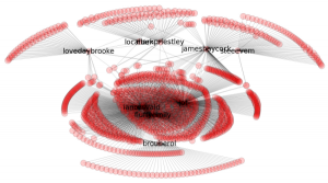
Below I show the follower graph with my new colleagues at the top (James, Kat, Ben, Mark, Steve), Emily, Jon and myself in the middle and my collaborator Balthazar at the bottom:
I chose to visualise followers rather than who-we-follow as I cared about the graph of who-pays-(some)-attention-to-us. I figure this is a good surrogate for people who might actually know us, suggesting a good chance that we have friends and colleagues in common.
Balthazar worked in France with me in StrongSteam (whilst I was in Chile), he’s followed by almost nobody from my usual network. Emily and I are a couple, we’re followed by a lot of the same people. Our friend Jon lives in Brighton and runs the central co-working environment (where we were for 10 years), he is followed by many of the people who follow us. The top of the graph shows that my colleagues are followed by only a few people who follow others in the company (so we all have different social networks), with the exception of boss-James who shares a set of followers with my Jon and myself (I guess because we’re all outspoken in the UK tech scene).
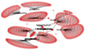
In the above graph I deliberately reduced the number of nodes drawn if they were only connected to one person in the network. Seeing as a few of us have over a thousand followers the graph got too busy too quickly. Below is a subsampled version of the early network with no limit on the number of one-edge-only nodes:
The subsampled network looks nicely organic, like living cells.
The code is on github as twitter-social-graph-networkx, it includes some patches that have just been added back to the python-twitter module to enable whole-graph downloading. You can use this code to download the follower graph for your own network, then plot it using NetworkX (it is configured to use GraphViz as the plots are faster, you can use pure NetworkX if you don’t have GraphViz). The git project has pickles of my social network so if you satisfy the dependencies, you should be good to plot straight away.
Ian is a Chief Interim Data Scientist via his Mor Consulting. Sign-up for Data Science tutorials in London and to hear about his data science thoughts and jobs. He lives in London, is walked by his high energy Springer Spaniel and is a consumer of fine coffees.

