On Saturday six of us attended the Future Cities Hackathon organised by Carlos and DataScienceLondon (@ds_ldn). I counted about 100 people in the audience (see lots of photos, original meetup thread), from asking around there seemed to be a very diverse skill set (Python and R as expected, lots of Java/C, Excel and other tools). There were several newly-released data sets to choose from. We spoke with Len Anderson of SocITM who works with Local Government, he suggested that the parking datasets for Westminster Ward might be interesting as results with an economic outcome might actually do something useful for Government Policy. This seemed like a sensible reason to tackle the data. Other data sets included flow-of-people and ASBO/dog-mess/graffiti recordings.
Overall we won ‘honourable mention’ for proposing the idea that the data supported a method of changing parking behaviour whilst introducing the idea of a dynamic pricing model so that parking spaces might be better utilised and used to generate increased revenue for the council. I suspect that there are more opportunities for improving the efficiency of static systems as the government opens more data here in the UK.
Sidenote – previously I’ve thought about the replacement of delivery drivers with self-driving cars and other outcomes of self-driving vehicles, the efficiencies discussed here connect with those ideas.
With the parking datasets we have over 4 million lines of cashless parking-meter payments for 2012-13 in Westminster to analyse, tagged with duration (you buy a ticket at a certain time for fixed periods of time like 30 minutes, 2 hours etc) and a latitude/longitude for location. We also had a smaller dataset with parking offence tickets (with date/time and location – but only street name, not latitude/longitude) and a third set with readings from the small number of parking sensors in Westminster.
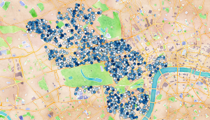
Ultimately we produced a geographic plot of over 1000 parking bays, coloured by average percentage occupancy in Westminster. The motivation was to show that some bays are well used (i.e. often have a car parked in them) whilst other areas are under-utilised and could take a higher load (darker means better utilised):
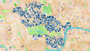
At first we thought we’d identified a striking result. After a few more minutes hacking (around 9.30pm on the Saturday) we pulled out the variance in pricing per bay and noted that this was actually quite varied and confusing, so a visitor to the area would have a hard time figuring out which bays were likely to be both under-utilised and cheap (darker means more expensive):
If we’d have had more time we’d have checked to see which bays were likely to be under-utilised and cheap and ranked the best bays in various areas. One can imagine turning this into a smartphone app to help visitors and locals find available parking.
The video below shows the cost and availability of parking over the course of the day. Opacity (how see-through it is) represents the expense – darker means more expensive (so you want to find very-see-through areas). Size represents the number of free spaces, bigger means more free space, smaller (i.e. during the working day) shows that there are few free spaces:
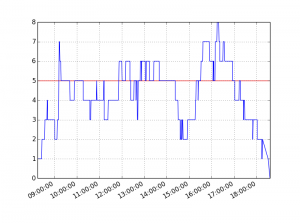
Behind this model we captured the minute-by-minute stream of ticket purchases by lat/lng to model the occupancy of bays, the data also records the number of bays that can be maximally used (but the payment machines don’t know how many are in use – we had to model this). Using Pandas we modelled usage over time (+1 for each ticket purchase and -1 for each expiry), the red line shows the maximum number of bays that are available, the sections over the line suggest that people aren’t parking for their full allocation (e.g. you might buy an hour’s ticket but only stay for 20 minutes, then someone else buys a ticket and uses the same bay):
We extended the above model for one Tuesday over all the 1000+ plus parking bays in Westminster.
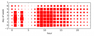
Additionally this analysis by shows the times and days when parking tickets are most likely to be issued. The 1am and 3am results were odd, Sunday (day 6) is clearly the quietest, weekdays at 9am are obviously the worst:
Conclusion:
We believe that the carrot and stick approach to parking management (showing where to park – and noting that you’ll likely get fined if you don’t do it properly) should increase the correct utilisation of parking bays in Westminster which would help to reduce congestion and decrease driver-frustration, whilst increasing income for the local council.
Update – at least one parking area in New Zealand are experimenting with truly dynamic demand-based pricing.
We also believe the data could be used by Traffic Wardens to better patrol the high-risk areas to deter poor parking (e.g. double-parking) which can be a traffic hazard (e.g. by obstructing a road for larger vehicles like Fire Engines). The static dataset we used could certainly be processed for use in a smartphone app for easy use, and updated as new data sets are released.
Our code is available in this github repo: ParkingWestminster.
Here’s our presentation:
Team:
- Amit Nandi
- Bart Baddeley
- Dominic Steinitz (Dominic’s write-up)
- Jackie Steinitz
- Ian Ozsvald (me!)
- Mateusz Łapsa-Malawski
Tools used:
- Python and IPython
- Pandas
- QGIS (visualisation of shapefiles backed by OpenLayers maps from Google and OSM)
- pyshp to handle shapefiles
- Excel (quick analysis of dates and times, quick visualisation of lat/lng co-ords)
- HackPad (useful for lightweight note/URL sharing and code snippet collaboration)
Some reflections for future hackathons:
- Pre-cleaning of data would speed team productivity (we all hacked various approaches to fixing the odd Date and separate Time fields in the CSV data and I suspect many in the room all solved this same problem over the first hour or two…we should have flagged this issue early on and a couple of us solved it and written out a new 1.4GB fixed CSV file for all to share)
- Decide early on on a goal – for us it was “work to show that a dynamic pricing model is feasible” – that lets you frame and answer early questions (quite possibly an hour in we’d have discovered that the data didn’t support our hypothesis – thankfully it did!)
- Always visualise quickly – whilst I wrote a new shapefile to represent the lat/lng data Bart just loaded it into Excel and did a scatter plot – super quick and easy (and shortly after I added the Map layer via QGIS so we could line up street names and validate we had sane data)
- Check for outliers and odd data – we discovered lots of NaN lines (easily caught and either deleted or fixed using Pandas), these if output and visualised were interpreted by QGIS as an extreme but legal value and so early on we had some odd visuals, until we eyeballed the generated CSV files. Always watch for NaNs!
- It makes sense to print a list of extreme and normal values for a column, again as a sanity check – histograms are useful, also sets of unique values if you have categories
- Question whether the result we see actually would match reality – having spent hours on a problem it is nice to think you’ve visualised something new and novel but probably the data you’re drawing is already integrated (e.g. in our case at least some drivers in Westminster would know where the cheap/under-utilised parking spaces would be – so there shouldn’t be too many)
- Setup a github repo early and make sure all the team can contribute (some of our team weren’t experienced with github so we deferred this step and ended up emailing code…that was a poor use of time!)
- Go visit the other teams – we hacked so intently we forgot to talk to anyone else…I’m sure we’d have learned and skill-shared had we actually stepped away from our keyboards!
Update – Stephan Hügel has a nice article on various Python tools for making maps of London wards, his notes are far more in-depth than the approach we took here.
Update – nice picture of London house prices by postcode, this isn’t strictly related to the above but it is close enough. Visualising the workings of the city feels rather powerful. I wonder how the house prices track availability of public transport and local amenities?
Ian is a Chief Interim Data Scientist via his Mor Consulting. Sign-up for Data Science tutorials in London and to hear about his data science thoughts and jobs. He lives in London, is walked by his high energy Springer Spaniel and is a consumer of fine coffees.


6 Comments